Categorygithub.com/go-curses/ctk
modulepackage
0.5.14
Repository: https://github.com/go-curses/ctk.git
Documentation: pkg.go.dev

# README

Go-Curses

Made with Go Go documentation

CTK - Curses Tool Kit

Golang package to provide an advanced terminal user interface with a GTK inspired API, built upon CDK.

Notice

This project should not be used for any purpose other than intellectual curiosity. This status is reflected in the tagged versioning of this trunk branch, v0.5.x, ie: still experimental and unfinished yet getting near the word "done".

Getting Started

CTK is a Go module and as such can be used in any of the typical Golang ways.

Prerequisites

Go v1.21 (or later) is required in order to build and use the package. Beyond that, there aren't any other dependencies. Visit: https://golang.org/doc/install for installation instructions.

Installing

CTK uses the Go mod system and is installed in any of the usual ways.

$ go get github.com/go-curses/ctk@latest

Programming Hello World in CTK

The following application will display a window with "Hello World" as the title, containing a button centered nicely that when pressed will exit the application nicely.

package main

import (
  "os"

  "github.com/go-curses/cdk"
  "github.com/go-curses/cdk/lib/enums"
  "github.com/go-curses/cdk/log"
  "github.com/go-curses/ctk"
)

func main() {
  // Construct a new CDK application
  app := cdk.NewApplication(
    // program binary name
    "hello-world",
    // usage summary
    "Simple Hello World example for CTK",
    // description
    "A simple terminal program written using the Curses Tool Kit",
    // because versioning is important
    "0.0.1",
    // used in logs, internal debugging, etc
    "helloWorld",
    // used where human-readable titles are necessary
    "Hello World",
    // the TTY device to use, /dev/tty is the default
    "/dev/tty",
    // initialize the user-interface
    func(d cdk.Display) error {
      // tell the display to listen for CTRL+C and interrupt gracefully
      d.CaptureCtrlC()
      // create a new window, give it a human-readable title
      w := ctk.NewWindowWithTitle("Hello World")
      // get the vertical box for the content area of the window
      vbox := w.GetVBox()
      // here is where we add other widgets and such to implement the
      // desired user interface elements, in this case we want a nice
      // button in the middle of the window. One way to do this is to
      // use an Alignment widget to place the button neatly for us.
      align := ctk.MakeAlignment()
      // the alignment scales are from 0 (left) to 1 (right) with the 0.5
      // being centered
      align.Set(0.5, 0.5, 0.0, 0.0)
      // a nice button for us to press
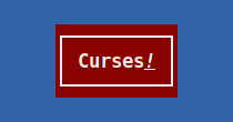
      button := ctk.NewButtonWithLabel("Curses<u><i>!</i></u>")
      button.SetUseMarkup(true)    // enable markup in the label
      button.SetSizeRequest(11, 3) // request a certain size
      // make the button quit the application when activated by connecting
      // a handler to the button's activate signal
      button.Connect(
        ctk.SignalActivate,
        "hello-button-handle",
        func(data []interface{}, argv ...interface{}) enums.EventFlag {
          d.RequestQuit() // ask the display to exit nicely
          return enums.EVENT_STOP
        },
      )
      align.Add(button) // add the button to the alignment
      // finally adding the alignment to the window's content area by
      // packing them into the window's vertical box
      vbox.PackStart(align, true /*expand*/, true /*fill*/, 0 /*padding*/)
      // tell CTK that the window and its contents are to be drawn upon
      // the terminal display, this effectively calls Show() on the vbox,
      // alignment and button
      w.ShowAll()
      // tell CDK that this window is the foreground window
      d.SetActiveWindow(w)
      // add a quit handler to say goodbye when the program exits
      d.AddQuitHandler(
        "hello-world-quit-handler",
        func() {
          // Note that the Display and other CTK things are no longer
          // functional at this point.
          fmt.Println("Hello World says Goodbye!")
          // Logging however still works.
          log.InfoF("Hello World logging goodbye!")
        },
      )
      // no errors to report, nil to proceed
      return nil
    },
  )
  // run the application, handing over the command-line arguments received
  if err := app.Run(os.Args); err != nil {
    // doesn't have to be a Fatal exit
    log.Fatal(err)
  }
  // end of program
}

Compile the hello-world.go source file.

$ go build examples/hello-world/hello-world.go

View the command-line help:

$ ./hello-world -h
NAME:
   hello-world - hello-world

USAGE:
   hello-world [global options] command [command options] [arguments...]

VERSION:
   0.0.1

DESCRIPTION:
   the most basic CTK application

COMMANDS:
   help, h  Shows a list of commands or help for one command

GLOBAL OPTIONS:
   --help, -h, --usage  display command-line usage information (default: false)
   --version            display the version (default: false)

Run the program:

$ ./hello-world

hello-world screenshot

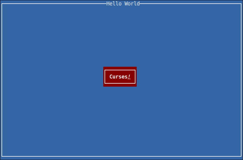
Pressing the Curses! button will exit the program and print the quit message to the terminal, which should have cleanly cleared the screen and restored the terminal to shell control again.

Commands

CTK includes a number of command programs for the purpose of enabling a better developer experience or as a means of having a necessity in creating new widgets and features.

go-dialog

go-dialog is a dialog replacement, fully implemented in CTK and takes advantage of Glade interface files for implementing the user interface.

Installation
$ go install github.com/go-curses/ctk/cmd/go-dialog
Usage
$ ./go-dialog --help
NAME:
   go-dialog - display dialog boxes from shell scripts

USAGE:
   go-dialog [global options] command [command options] [arguments...]

VERSION:
   0.0.1

COMMANDS:
   msgbox   display a message with an OK button, each string following msgbox is a new line and concatenated into the message
   yesno    display a yes/no prompt with a message (see msgbox)
   help, h  Shows a list of commands or help for one command

GLOBAL OPTIONS:
   --title value                     specify the dialog title text
   --print-maxsize                   print the width and height on stdout and exit (default: false)
   --back-title value                specify the window title text
   --help, -h, --usage               display command-line usage information (default: false)
   --version                         display the version (default: false)
Example

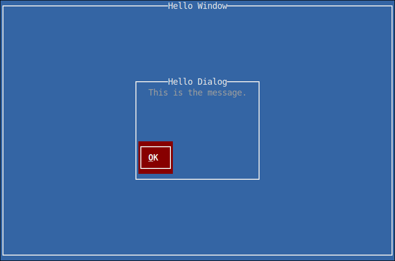
Display a message-box dialog (with the title of "Hello Dialog"), centered on top of a full-screen window (with the title "Hello Window"), displaying a message of "This is the message" and presenting a single button labelled "OK".

$ ./go-dialog \
   --back-title "Hello Window" \
   --title "Hello Dialog" \
   msgbox \
   "This is the message."

go-dialog screenshot

go-charmap

This is a simple character-set viewer called go-charmap.

Installation
$ go install github.com/go-curses/ctk/cmd/go-charmap
Usage
$ ./go-charmap --help
NAME:
   go-charmap - View the details of a character

USAGE:
   go-charmap [integer]

VERSION:
   0.0.1

DESCRIPTION:
   Get informational details for a specific character given in integer form.

COMMANDS:
   help, h  Shows a list of commands or help for one command

GLOBAL OPTIONS:
   --help, -h, --usage  display command-line usage information (default: false)
   --version            display the version (default: false)

Example

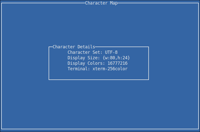
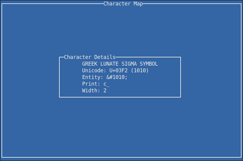
Display information on the current terminal settings.

$ go-charmap

go-charmap screenshot

Display information on the lowercase sigma character.

$ go-charmap 1010

go-charmap 1010 screenshot

go-ctk

This is a weird one. go-ctk can do a number of things related to working on the CTK project, some useful for normal developers. Particularly the glade option, so that's the one we're going to talk about here.

The glade option for go-ctk enables the developer to test their Glade interface files outside of their normal codebase, as a means of validating whether their problems are in their code or with how CTK is handling the Glade files.

For those not aware, Glade is the formal way to design user interfaces for actual GTK applications. Given that CTK is a curses implementation of GTK, it supports loading widgets and such from Glade interface files.

There are of course all sorts of undocumented and unknown caveats to the support of Glade and all it's configurable features at this time. It is an objective of CTK to formally support Glade as much as sensibly possible.

Usage
$ ./go-ctk help glade
NAME:
   go-ctk glade - preview glade interfaces

USAGE:
   go-ctk glade [command options] [arguments...]

DESCRIPTION:
   load the given .glade file and preview in CTK

OPTIONS:
   --window value, -W value   specify a named (glade "id" attribute) window to preview (default: main-window)
   --dialog value, -D value   specify a named (glade "id" attribute) dialog to preview (default: main-dialog)
   --no-dialog-transient, -n  when rendering ctk.Dialog types, do not set the transient-for to a default window and use the dialog itself as a top-level window (default: false)
Example

There are two example glade files in the examples directory. This example command will load the builder-dialog.glade file and if all is working as it should, display a window with a dialog containing some lorem ipsum text and two buttons, a yes and a no.

For this to work however, it's important to note that within glade we need to set the id on the window and dialog objects. go-ctk defaults to "main-window" and "main-dialog", which the example files use. That's the purpose to the --window and --dialog command-line options.

$ ./go-ctk glade ./examples/builder-dialog.glade

go-ctk glade screenshot

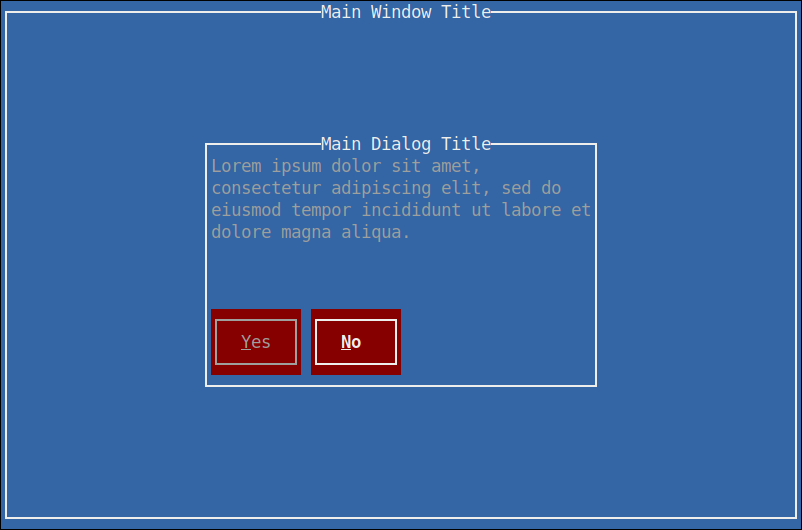
Pressing either of the buttons will exit the viewer and print out which button was pressed.

button pressed: ctk-button-2194440b-86b2-4386-a5a1-984bfec916e6 "Yes"

Running the unit tests

Normal go testing mechanics work.

$ go test -v
=== RUN   TestAdjustment

  ... (per-test output, trimmed for brevity) ...

--- PASS: TestWidget (0.00s)
PASS
ok  	github.com/go-curses/ctk	(0.018s)

Makefile

Included is a Makefile that has a number of useful build targets, as shown in the usage help text.

$ make help
usage: make [target]

qa targets:
  vet         - run go vet command
  test        - perform all available tests
  cover       - perform all available tests with coverage report

cleanup targets:
  clean       - cleans package and built files
  clean-logs  - cleans *.log from the project

go.mod helpers:
  local       - add go.mod local CDK package replacements
  unlocal     - remove go.mod local CDK package replacements

build targets:
  examples    - builds all examples
  build       - build the go-ctk command
  build-all   - build all commands
  dev         - build demo-app with profiling

run targets:
  run         - run the dev build (sanely handle crashes)
  profile.cpu - run the dev build and profile CPU
  profile.mem - run the dev build and profile memory

Versioning

The current API is unstable and subject to change dramatically.

License

This project is licensed under the Apache License, Version 2.0 - see the LICENSE.md file for details.

Acknowledgments

  • Thanks to TCell for providing a solid and robust platform to build upon
  • Thanks to the GTK Team for developing and maintaining the GTK API that CTK is modeled after

# Packages

No description provided by the author

# Functions

Registers each of the stock items in items.
No description provided by the author
ArgvSpinnerEvents is a convenience function of recasting the arguments for SignalSpinnerStart, SignalSpinnerTick and SignalSpinnerStop events emitted by Spinner widgets.
No description provided by the author
GetAccelMap is the getter for the current Application AccelMap singleton.
No description provided by the author
Retrieves a list of all known stock IDs added to an IconFactory or registered with StockAdd().
Retrieve a stock item by ID.
No description provided by the author
MakeAccelGroup is used by the Buildable system to construct a new AccelGroup.
Default constructor for Action objects.
MakeActionGroup is used by the Buildable system to construct a new ActionGroup.
MakeAdjustment is used by the Buildable system to construct a new Adjustment.
MakeAlignment is used by the Buildable system to construct a new Alignment with default settings of: xAlign=0.5, yAlign=1.0, xScale=0.5, yScale=1.0.
MakeArrow is used by the Buildable system to construct a new Arrow with a default ArrowType setting of ArrowRight.
MakeBin is used by the Buildable system to construct a new Bin.
MakeBox is used by the Buildable system to construct a new Box with default settings of: horizontal orientation, dynamically sized (not homogeneous) and no extra spacing.
MakeButton is used by the Buildable system to construct a new Button with a default label that is empty.
MakeButtonBox is used by the Buildable system to construct a new horizontal homogeneous ButtonBox with no spacing between the Widget children.
MakeDialog is used by the Buildable system to construct a new Dialog.
MakeEntry is used by the Buildable system to construct a new Entry.
MakeEventBox is used by the Buildable system to construct a new EventBox.
MakeFrame is used by the Buildable system to construct a new Frame.
No description provided by the author
MakeLabel is used by the Buildable system to construct a new Label.
MakeRadioAction is used by the Buildable system to construct a new RadioAction.
No description provided by the author
MakeSeparator is used by the Buildable system to construct a new Separator.
MakeSpinner is used by the Buildable system to construct a new Spinner with a default SpinnerType setting of SpinnerRight.
Default constructor for Style objects.
MakeToggleAction is used by the Buildable system to construct a new ToggleAction.
No description provided by the author
MakeViewport is used by the Buildable system to construct a new Viewport.
No description provided by the author
MakeWindow is used by the Buildable system to construct a new Window.
No description provided by the author
NewAccelGroup is the constructor for new AccelGroup instances.
No description provided by the author
Constructor for Action objects.
NewActionGroup is the constructor for new ActionGroup instances.
NewAdjustment is the constructor for new Adjustment instances.
NewAlignment is the constructor for new Alignment instances.
No description provided by the author
NewApplicationFromPlugin constructs an Application from a Go plugin shared object file.
NewArrow is the constructor for new Arrow instances.
NewBin is the constructor for new Bin instances.
NewBox is the constructor for new Box instances.
No description provided by the author
NewButton is a constructor for new Button instances without a label Widget.
NewButtonBox is a constructor for new Box instances.
NewButtonFromStock creates a NewButtonWithLabel containing the text from a stock item.
No description provided by the author
NewButtonWithLabel will construct a NewButton with a NewLabel, pre-configured for a centered placement within the new Button instance, taking care to avoid focus complications and default event handling.
NewButtonWithMnemonic creates a NewButtonWithLabel.
NewButtonWithWidget creates a NewButton with the given Widget as the Button's child.
No description provided by the author
NewContainer is the constructor for new Container instances.
No description provided by the author
NewDialog is the constructor for new Dialog instances.
NewDialogWithButtons creates a new Dialog with title, transient parent, a bitmask of DialogFlags and a variadic list of paired items.
NewEntry is the constructor for new Entry instances.
NewEventBox is the constructor for new EventBox instances.
NewFrame is the constructor for new Frame instances.
NewFrameWithWidget will construct a new Frame with the given widget instead of the default Label.
No description provided by the author
NewLabel is the constructor for new Label instances.
NewLabelWithMarkup creates a new Label, containing the text given and if the text contains Tango markup, the rendered text will display accordingly.
NewLabelWithMnemonic creates a new Label, containing the text given.
No description provided by the author
NewRadioAction is the constructor for new RadioAction instances.
No description provided by the author
NewSeparator is the constructor for new Separator instances.
NewSpinner is the constructor for new Spinner instances.
Constructor for Style objects.
No description provided by the author
NewToggleAction is the constructor for new ToggleAction instances.
No description provided by the author
NewViewport is the constructor for new Viewport instances.
No description provided by the author
NewWindow is a constructor for new Window instances.
NewWindowWithTitle is a constructor for new Window instances that also sets the Window title to the string given.
No description provided by the author
ValidStockId returns TRUE if the given StockID has been registered.
No description provided by the author

# Constants

No description provided by the author
Whether the event-trapping window of the eventbox is above the window of the child widget as opposed to below it.
No description provided by the author
Whether the window should receive the input focus.
The Icon displayed in the Action.
The name of the icon from the icon theme.
The label used for menu items and buttons that activate this action.
A unique name for the action.
Whether the action is enabled.
Whether the action is visible.
If the toggle action should be active in or not.
The Adjustment that contains the current value of this range object.
If TRUE, the action's menu item proxies will ignore the “gtk-menu-images” setting and always show their image, if available.
Whether the application will paint directly on the widget.
Appearance of the shadow surrounding the arrow.
The direction the arrow should point.
A list of style attributes to apply to the text of the label.
The width of the empty border outside the containers children.
The padding to insert at the bottom of the widget.
No description provided by the author
Text of the label widget inside the button, if the button contains a label widget.
Whether the widget can be the default widget.
Whether the widget can accept the input focus.
Can be used to add a new child to the container.
Whether the widget is part of a composite widget.
Whether buttons in dialogs should use the alternative button order.
Controls the direction of the sort indicators in sorted list and tree views.
Palette to use in the color selector.
A palette of named colors for use in themes.
Whether the cursor should blink.
Length of the cursor blink cycle, in milliseconds.
Time after which the cursor stops blinking, in seconds.
Name of the cursor theme to use, or NULL to use the default theme.
Number of pixels the cursor can move before dragging.
Maximum distance allowed between two clicks for them to be considered a double click (in pixels).
Maximum time allowed between two clicks for them to be considered a double click (in milliseconds).
Whether menu items should have visible accelerators which can be activated.
Whether labels and menu items should have visible mnemonics which can be activated.
Whether tooltips should be shown on widgets.
How long to show the last input character in hidden entries.
Whether to select the contents of an entry when it is focused.
When TRUE, keyboard navigation and other input-related errors will cause a beep.
Name of a icon theme to fall back to.
Name of the FileChooser backend to use by default.
Name of icon theme to use.
Which IM (input method) module should be used by default.
How to draw the input method preedit string.
How to draw the input method statusbar.
When TRUE, keyboard navigation should be able to reach all widgets by using the cursor keys only.
When TRUE, some widgets will wrap around when doing keyboard navigation, such as menus, menubars and notebooks.
Name of key theme RC file to load.
Whether to select the contents of a selectable label when it is focused.
Keybinding to activate the menu bar.
Delay before the submenus of a menu bar appear.
Whether images should be shown in menus.
The time before hiding a submenu when the pointer is moving towards the submenu.
Minimum time the pointer must stay over a menu item before the submenu appear.
List of currently active ctk modules.
Whether a click in a Range trough should scroll to the click position or scroll by a single page in the respective direction.
Where the contents of scrolled windows are located with respect to the scrollbars, if not overridden by the scrolled window's own placement.
Whether the context menus of entries and text views should offer to change the input method.
Whether the context menus of entries and text views should offer to insert control characters.
Name of theme RC file to load.
Expand value for timeouts, when a widget is expanding a new region.
Starting value for timeouts, when button is pressed.
Repeat value for timeouts, when button is pressed.
Whether default toolbars have text only, text and icons, icons only, etc.
Amount of time, in milliseconds, after which the browse mode will be disabled.
Controls the time after which tooltips will appear when browse mode is enabled, in milliseconds.
Time, in milliseconds, after which a tooltip could appear if the cursor is hovering on top of a widget.
When TRUE, there are no motion notify events delivered on this screen, and widgets can't use the pointer hovering them for any essential functionality.
The value property of the currently active member of the group to which this action belongs.
The current position of the insertion cursor in chars.
No description provided by the author
Whether the window should be decorated by the window manager.
The default height of the window, used when initially showing the window.
The default width of the window, used when initially showing the window.
Whether the window frame should have a close button.
If this window should be destroyed when the parent is destroyed.
Whether or not the widget is double buffered.
Whether the proxies for this action look like radio action proxies.
No description provided by the author
The preferred place to ellipsize the string, if the label does not have enough room to display the entire string, specified as a bool.
The event mask that decides what kind of Events this widget gets.
The mask that decides what kind of extension events this widget gets.
The fill level (e.g.
No description provided by the author
Whether the button grabs focus when it is clicked with the mouse.
Whether the window should receive the input focus when mapped.
The window gravity of the window.
Sets a new group for a radio action.
The Adjustment for the horizontal position.
No description provided by the author
Whether the widget is the default widget.
Whether the widget has the input focus.
Enables or disables the emission of query-tooltip on widget .
Whether the input focus is within this Window.
Override for height request of the widget, or -1 if natural request should be used.
When TRUE, empty menu proxies for this action are hidden.
Whether the children should all be the same size.
When the horizontal scrollbar is displayed.
Icon for this window.
The :icon-name property specifies the name of the themed icon to use as the window icon.
No description provided by the author
Child widget to appear next to the button text.
The position of the image relative to the text inside the button.
Invert direction slider moves to increase range value.
Whether the toplevel is the current active window.
Whether the widget is the focus widget within the toplevel.
Whether the action is considered important.
Is the accel group locked.
The alignment of the lines in the text of the label relative to each other.
The text of the label.
If set, an underline in the text indicates the next character should be used for the mnemonic accelerator key.
A widget to display in place of the usual frame label.
The horizontal alignment of the label.
The vertical alignment of the label.
How to lay out the buttons in the box.
The padding to insert at the left of the widget.
The minimum value of the adjustment.
The sensitivity policy for the stepper that points to the adjustment's lower side.
The desired maximum width of the label, in characters.
The mnemonic accelerator key for this label.
Whether mnemonics are currently visible in this window.
The widget to be activated when the label's mnemonic key is pressed.
If TRUE, the window is modal (other windows are not usable while this one is up).
Modifier Mask.
The name of the widget.
Whether ShowAll should not affect this widget.
The requested opacity of the window.
The orientation of the orientable.
The page increment of the adjustment.
The page size of the adjustment.
The parent widget of this widget.
The value is an arbitrary integer which can be used as a convenient way to determine which action in the group is currently active in an ::activate or ::changed signal handler.
If TRUE, the widget will receive the default action when it is focused.
The action that this activatable will activate and receive updates from for various states and possibly appearance.
The border relief style.
If TRUE, users can resize the window.
Specify how resize events are handled.
The restrict-to-fill-level property controls whether slider movement is restricted to an upper boundary set by the fill level.
The padding to insert at the right of the widget.
Unique identifier for the window to be used when restoring a session.
The number of digits to round the value to when it changes, or -1.
The screen where this window will be displayed.
Style of bevel around the contents.
Whether the label text can be selected with the mouse.
The position of the opposite end of the selection from the cursor in chars.
Whether the widget responds to input.
Deprecated property, use shadow_type instead.
Appearance of the frame border.
A shorter label that may be used on toolbar buttons.
The show-fill-level property controls whether fill level indicator graphics are displayed on the trough.
Whether the label is in single line mode.
TRUE if the window should not be in the pager.
TRUE if the window should not be in the task bar.
The amount of space between children.
The :startup-id is a write-only property for setting window's startup notification identifier.
The step increment of the adjustment.
The stock icon displayed in widgets representing this action.
The style of the widget, which contains information about how it will look (colors etc).
No description provided by the author
The title of the window.
A tooltip for this action.
Sets the text of tooltip to be the given string, which is marked up with the Tango text markup language.
Sets the text of tooltip to be the given string.
The padding to insert at the top of the widget.
Set this property to TRUE to make the label track which links have been clicked.
The transient parent of the window.
Hint to help the desktop environment understand what kind of window this is and how to treat it.
How the range should be updated on the screen.
The maximum value of the adjustment.
The sensitivity policy for the stepper that points to the adjustment's upper side.
TRUE if the window should be brought to the user's attention.
Whether this activatable should reset its layout and appearance when setting the related action or when the action changes appearance.
The text of the label includes XML markup.
If set, the label is used to pick a stock item instead of being displayed.
If set, an underline in the text indicates the next character should be used for the mnemonic accelerator key.
The Adjustment for the vertical position.
The value of the adjustment.
The Adjustment that determines the values of the horizontal position for this viewport.
Determines how the shadowed box around the viewport is drawn.
The Adjustment that determines the values of the vertical position for this viewport.
Whether the widget is visible.
Whether the toolbar item is visible when the toolbar is in a horizontal orientation.
When TRUE, toolitem proxies for this action are represented in the toolbar overflow menu.
Whether the toolbar item is visible when the toolbar is in a vertical orientation.
Whether the event box is visible, as opposed to invisible and only used to trap events.
When the vertical scrollbar is displayed.
The desired width of the label, in characters.
Override for width request of the widget, or -1 if natural request should be used.
The widget's window if it is realized, NULL otherwise.
Where the contents are located with respect to the scrollbars.
Whether "window-placement" should be used to determine the location of the contents with respect to the scrollbars.
The initial position of the window.
The type of the window.
If set, wrap lines if the text becomes too wide.
If line wrapping is on (see the “wrap” property) this controls how the line wrapping is done.
Horizontal position of child in available space.
The amount of space to add on the left and right of the widget, in pixels.
If available horizontal space is bigger than needed for the child, how much of it to use for the child.
Vertical position of child in available space.
The amount of space to add on the top and bottom of the widget, in pixels.
If available vertical space is bigger than needed for the child, how much of it to use for the child.
No description provided by the author
The accel-activate signal is an implementation detail of AccelGroup and not meant to be used by applications.
The accel-changed signal is emitted when a CAccelGroupEntry is added to or removed from the accel group.
No description provided by the author
The "activate" signal is emitted when the action is activated.
No description provided by the author
A keybinding signal which gets emitted when the user activates a link in the label.
The ::activate-default signal is a which gets emitted when the user activates the default widget of window .
The ::activate-focus signal is a which gets emitted when the user activates the currently focused widget of window .
The signal which gets emitted to activate a URI.
Listener function arguments: widget Widget.
Listener function arguments: arg1 float64.
No description provided by the author
The ::button-press-event signal will be emitted when a button (typically from a mouse) is pressed.
The ::button-release-event signal will be emitted when a button (typically from a mouse) is released.
Determines whether an accelerator that activates the signal identified by signal_id can currently be activated.
No description provided by the author
The ::changed signal is emitted at the end of a single user-visible operation on the contents of the Editable.
The ::change-value signal is emitted when a scroll action is performed on a range.
No description provided by the author
The ::child-notify signal is emitted for each changed on an object.
No description provided by the author
Emitted when the button has been activated (pressed and released).
The ::client-event will be emitted when the widget 's window receives a message (via a ClientMessage event) from another application.
The ::close signal is a which gets emitted when the user uses a keybinding to close the dialog.
The ::composited-changed signal is emitted when the composited status of widget s screen changes.
No description provided by the author
The ::configure-event signal will be emitted when the size, position or stacking of the widget 's window has changed.
The ::connect-proxy signal is emitted after connecting a proxy to an action in the group.
The ::copy-clipboard signal is a which gets emitted to copy the selection to the clipboard.
Emitted when a redirected window belonging to widget gets drawn into.
The ::delete-event signal is emitted if a user requests that a toplevel window is closed.
This signal is emitted when text is deleted from the widget by the user.
The ::destroy-event signal is emitted when a Window is destroyed.
The ::direction-changed signal is emitted when the text direction of a widget changes.
The ::disconnect-proxy signal is emitted after disconnecting a proxy from an action in the group.
The ::drag-begin signal is emitted on the drag source when a drag is started.
The ::drag-data-delete signal is emitted on the drag source when a drag with the action GDK_ACTION_MOVE is successfully completed.
The ::drag-data-get signal is emitted on the drag source when the drop site requests the data which is dragged.
The ::drag-data-received signal is emitted on the drop site when the dragged data has been received.
The ::drag-drop signal is emitted on the drop site when the user drops the data onto the widget.
The ::drag-end signal is emitted on the drag source when a drag is finished.
The ::drag-failed signal is emitted on the drag source when a drag has failed.
The ::drag-leave signal is emitted on the drop site when the cursor leaves the widget.
The drag-motion signal is emitted on the drop site when the user moves the cursor over the widget during a drag.
No description provided by the author
Emitted when the pointer enters the button.
The ::enter-notify-event will be emitted when the pointer enters the widget 's window.
No description provided by the author
The CTK main loop will emit three signals for each GDK event delivered to a widget: one generic ::event signal, another, more specific, signal that matches the type of event delivered (e.g.
After the emission of the event signal and (optionally) the second more specific signal, ::event-after will be emitted regardless of the previous two signals handlers return values.
No description provided by the author
The ::expose-event signal is emitted when an area of a previously obscured Window is made visible and needs to be redrawn.
No description provided by the author
Listener function arguments: widget Widget.
The ::focus-in-event signal will be emitted when the keyboard focus enters the widget 's window.
The ::focus-out-event signal will be emitted when the keyboard focus leaves the widget 's window.
No description provided by the author
Emitted when a pointer or keyboard grab on a window belonging to widget gets broken.
No description provided by the author
The ::grab-notify signal is emitted when a widget becomes shadowed by a CTK grab (not a pointer or keyboard grab) on another widget, or when it becomes unshadowed due to a grab being removed.
No description provided by the author
The ::hierarchy-changed signal is emitted when the anchored state of a widget changes.
No description provided by the author
This signal is emitted when text is inserted into the widget by the user.
No description provided by the author
Gets emitted if keyboard navigation fails.
The ::key-press-event signal is emitted when a key is pressed.
The ::key-release-event signal is emitted when a key is pressed.
The ::keys-changed signal gets emitted when the set of accelerators or mnemonics that are associated with window changes.
Emitted when the pointer leaves the button.
The ::leave-notify-event will be emitted when the pointer leaves the widget 's window.
No description provided by the author
The ::map-event signal will be emitted when the widget 's window is mapped.
No description provided by the author
The ::motion-notify-event signal is emitted when the pointer moves over the widget's Window.
The ::move-cursor signal is a which gets emitted when the user initiates a cursor movement.
Listener function arguments: direction DirectionType.
Listener function arguments: arg1 DirectionType.
Virtual function that moves the slider.
No description provided by the author
The ::no-expose-event will be emitted when the widget 's window is drawn as a copy of another Drawable (with DrawDrawable or WindowCopyArea) which was completely unobscured.
No description provided by the author
The ::parent-set signal is emitted when a new parent has been set on a widget.
No description provided by the author
The ::populate-popup signal gets emitted before showing the context menu of the label.
This signal gets emitted whenever a widget should pop up a context menu.
The ::post-activate signal is emitted just after the action in the action_group is activated This is intended for UIManager to proxy the signal and provide global notification just after any action is activated.
The ::pre-activate signal is emitted just before the action in the action_group is activated This is intended for UIManager to proxy the signal and provide global notification just before any action is activated.
Emitted when the button is pressed.
The ::property-notify-event signal will be emitted when a property on the widget 's window has been changed or deleted.
To receive this signal the Window associated to the widget needs to enable the GDK_PROXIMITY_IN_MASK mask.
To receive this signal the Window associated to the widget needs to enable the GDK_PROXIMITY_OUT_MASK mask.
No description provided by the author
Emitted when has-tooltip is TRUE and the gtk-tooltip-timeout has expired with the cursor hovering "above" widget ; or emitted when widget got focus in keyboard mode.
The ::changed signal is emitted on every member of a radio group when the active member is changed.
No description provided by the author
Emitted when the button is released.
No description provided by the author
Listener function arguments: widget Widget.
No description provided by the author
Emitted when an action widget is clicked, the dialog receives a delete event, or the application programmer calls Response.
The ::screen-changed signal gets emitted when the screen of a widget has changed.
The ::scroll-child signal is a which gets emitted when a keybinding that scrolls is pressed.
The ::scroll-event signal is emitted when a button in the 4 to 7 range is pressed.
The ::selection-clear-event signal will be emitted when the the widget 's window has lost ownership of a selection.
Listener function arguments: data SelectionData info int time int.
No description provided by the author
Listener function arguments: data SelectionData time int.
The ::selection-request-event signal will be emitted when another client requests ownership of the selection owned by the widget 's window.
No description provided by the author
Listener function arguments: widget Widget.
No description provided by the author
Set the scroll adjustments for the viewport.
No description provided by the author
Listener function arguments: allocation Rectangle.
Listener function arguments: requisition Requisition.
No description provided by the author
The ::state-changed signal is emitted when the widget state changes.
The ::style-set signal is emitted when a new style has been set on a widget.
No description provided by the author
The ::unmap-event signal will be emitted when the widget 's window is unmapped.
No description provided by the author
The ::visibility-notify-event will be emitted when the widget 's window is obscured or unobscured.
The ::window-state-event will be emitted when the state of the toplevel window associated to the widget changes.
No description provided by the author
CDK type-tag for ActionGroup objects.
No description provided by the author

# Variables

No description provided by the author
go:embed ctk.default.styles.
No description provided by the author

# Structs

No description provided by the author
The CAccelGroup structure implements the AccelGroup interface and is exported to facilitate type embedding with custom implementations.
No description provided by the author
The CAccelMap structure implements the AccelMap interface and is exported to facilitate type embedding with custom implementations.
The CAction structure implements the Action interface and is exported to facilitate type embedding with custom implementations.
The CActionGroup structure implements the ActionGroup interface and is exported to facilitate type embedding with custom implementations.
The CAdjustment structure implements the Adjustment interface and is exported to facilitate type embedding with custom implementations.
The CAlignment structure implements the Alignment interface and is exported to facilitate type embedding with custom implementations.
No description provided by the author
The CArrow structure implements the Arrow interface and is exported to facilitate type embedding with custom implementations.
The CBin structure implements the Bin interface and is exported to facilitate type embedding with custom implementations.
The CBox structure implements the Box interface and is exported to facilitate type embedding with custom implementations.
No description provided by the author
The CButton structure implements the Button interface and is exported to facilitate type embedding with custom implementations.
The CButtonBox structure implements the ButtonBox interface and is exported to facilitate type embedding with custom implementations.
The CContainer structure implements the Container interface and is exported to facilitate type embedding with custom implementations.
The CDialog structure implements the Dialog interface and is exported to facilitate type embedding with custom implementations.
The CTextField structure implements the Entry interface and is exported to facilitate type embedding with custom implementations.
The CEventBox structure implements the EventBox interface and is exported to facilitate type embedding with custom implementations.
No description provided by the author
The CFrame structure implements the Frame interface and is exported to facilitate type embedding with custom implementations.
No description provided by the author
The CLabel structure implements the Label interface and is exported to facilitate type embedding with custom implementations.
The CMisc structure implements the Misc interface and is exported to facilitate type embedding with custom implementations.
The CObject structure implements the Object interface and is exported to facilitate type embedding with custom implementations.
The CRadioAction structure implements the RadioAction interface and is exported to facilitate type embedding with custom implementations.
The CRange structure implements the Range interface and is exported to facilitate type embedding with custom implementations.
The CScrollbar structure implements the Scrollbar interface and is exported to facilitate type embedding with custom implementations.
No description provided by the author
The CSeparator structure implements the Separator interface and is exported to facilitate type embedding with custom implementations.
The CSettings structure implements the Settings interface and is exported to facilitate type embedding with custom implementations.
The CSpinner structure implements the Spinner interface and is exported to facilitate type embedding with custom implementations.
The CStyle structure implements the Style interface and is exported to facilitate type embedding with custom implementations.
No description provided by the author
The CToggleAction structure implements the ToggleAction interface and is exported to facilitate type embedding with custom implementations.
No description provided by the author
The CViewport structure implements the Viewport interface and is exported to facilitate type embedding with custom implementations.
No description provided by the author
The CWidget structure implements the Widget interface and is exported to facilitate type embedding with custom implementations.
The CWindow structure implements the Window interface and is exported to facilitate type embedding with custom implementations.
No description provided by the author

# Interfaces

No description provided by the author
AccelGroup Hierarchy: Object +- AccelGroup An AccelGroup represents a group of keyboard accelerators, typically attached to a toplevel Window (with Window.AddAccelGroup).
No description provided by the author
AccelMap Hierarchy: Object +- AccelMap The AccelMap is the global accelerator mapping object.
Action Hierarchy: Object +- Action +- ToggleAction +- RecentAction Actions represent operations that the user can perform, along with some information how it should be presented in the interface.
ActionGroup Hierarchy: Object +- ActionGroup.
Activatable Hierarchy: CInterface +- Activatable.
Adjustment Hierarchy: Object +- Adjustment The Adjustment CTK object is a means of managing the state of multiple widgets concurrently.
An Alignable Widget is one that implements the SetAlignment and GetAlignment methods for adjusting the positioning of the Widget.
Alignment Hierarchy: Object +- Widget +- Container +- Bin +- Alignment The Alignment widget controls the alignment and size of its child widget.
Application Hierarchy: Object +- Application An Application is the CTK replacement for cdk.Application.
Arrow Hierarchy: Object +- Widget +- Misc +- Arrow The Arrow Widget should be used to draw simple arrows that need to point in one of the four cardinal directions (up, down, left, or right).
Bin Hierarchy: Object +- Widget +- Container +- Bin +- Window +- Alignment +- Frame +- Button +- Item +- ComboBox +- EventBox +- Expander +- HandleBox +- ToolItem +- ScrolledWindow +- Viewport The Bin Widget is a Container with just one child.
Box Hierarchy: Object +- Widget +- Container +- Box +- ButtonBox +- VBox +- HBox The Box Widget is a Container for organizing one or more child Widgets.
No description provided by the author
Button Hierarchy: Object +- Widget +- Container +- Bin +- Button +- ToggleButton +- ColorButton +- FontButton +- LinkButton +- OptionMenu +- ScaleButton The Button Widget is a Bin Container that represents a focusable Drawable Widget that is Sensitive to event interactions.
ButtonBox Hierarchy: Object +- Widget +- Container +- Box +- ButtonBox +- HButtonBox +- VButtonBox The ButtonBox Widget is a Box Container that has a primary and a secondary grouping of its Widget children.
Container Hierarchy: Object +- Widget +- Container +- Bin +- Box +- CList +- Fixed +- Paned +- IconView +- Layout +- List +- MenuShell +- Notebook +- Socket +- Table +- TextView +- Toolbar +- ToolItemGroup +- ToolPalette +- Tree +- TreeView In the Curses Tool Kit, the Container interface is an extension of the CTK Widget interface and for all intents and purposes, this is the base class for any CTK type that will contain other widgets.
Dialog Hierarchy: Object +- Widget +- Container +- Bin +- Window +- Dialog +- AboutDialog +- ColorSelectionDialog +- FileChooserDialog +- FileSelection +- FontSelectionDialog +- InputDialog +- MessageDialog +- PageSetupUnixDialog +- PrintUnixDialog +- RecentChooserDialog The Dialog Widget is a Window with actionable Buttons, typically intended to be used as a transient for another Window rather than a Window on its own.
No description provided by the author
Editable Hierarchy: CInterface +- Editable.
Entry
Entry Hierarchy: Object +- Widget +- Misc +- Entry +- AccelLabel +- TipsQuery The Entry Widget presents text to the end user.
EventBox Hierarchy: Object +- Widget +- Container +- Bin +- EventBox The EventBox Widget is used to capture Widget events (mouse, keyboard) without needing having any defined user-interface.
Frame Hierarchy: Object +- Widget +- Container +- Bin +- Frame +- AspectFrame The Frame Widget wraps other Widgets with a border and optional title label.
No description provided by the author
Label Hierarchy: Object +- Widget +- Misc +- Label +- AccelLabel +- TipsQuery The Label Widget presents text to the end user.
Misc Hierarchy: Object +- Widget +- Misc +- Label +- Arrow +- Image +- Pixmap The Misc Widget is intended primarily as a base type for other Widget implementations where there is a necessity for alignment and padding properties.
Object in the Curses Tool Kit, is an extension of the CDK Object type and for all intents and purposes, this is the base class for any CTK type with no other CTK type embedding a CDK type directly.
No description provided by the author
RadioAction Hierarchy: Object +- Action +- ToggleAction +- RadioAction.
Range Hierarchy: Object +- Widget +- Range +- Scale +- Scrollbar The Range Widget is used to manage the position of things within some range of values.
Scrollbar Hierarchy: Object +- Widget +- Range +- Scrollbar +- HScrollbar +- VScrollbar The Scrollbar Widget is a Range Widget that draws steppers and sliders.
ScrolledViewport Hierarchy: Object +- Widget +- Container +- Bin +- ScrolledViewport.
No description provided by the author
Separator Hierarchy: Object +- Widget +- Container +- Bin +- Separator The Separator Widget is used to capture Widget events (mouse, keyboard) without needing having any defined user-interface.
Settings Hierarchy: Object +- Settings.
Spinner Hierarchy: Object +- Widget +- Misc +- Spinner The Spinner Widget needs documentation.
Style Hierarchy: Object +- Style.
ToggleAction Hierarchy: Object +- Action +- ToggleAction +- RadioAction.
Basic vbox interface.
No description provided by the author
Viewport Hierarchy: Object +- Widget +- Container +- Bin +- Viewport The Viewport widget acts as an adaptor class, implementing scrollability for child widgets that lack their own scrolling capabilities.
No description provided by the author
Widget Hierarchy: Object +- Widget +- Container +- Misc +- Calendar +- CellView +- DrawingArea +- Entry +- Ruler +- Range +- Separator +- HSV +- Invisible +- OldEditable +- Preview +- Progress Widget is the base class all widgets in CTK derive from.
Window Hierarchy: Object +- Widget +- Container +- Bin +- Window +- Dialog +- Assistant +- OffscreenWindow +- Plug In the Curses Tool Kit, the Window type is an extension of the CTK Bin type and also implements the cdk.Window interface so that it can be utilized within the Curses Development Kit framework.

# Type aliases

No description provided by the author
Stock items represent commonly-used menu or toolbar items such as "Open" or "Exit".
No description provided by the author